Signs for space

Dury is still out on the chairs.
Just put a secounf coat on.

I’ve painted three chairs as a test run for the signs.

Come to the space and have s look.

They look more orange than they old red.
Might need a secound attempt to get the color match we were expecting.

One in left hasn’t been painted

2 Likes

Looks good to me!

1 Like

Bright reds confound digital cameras​, so will have to see then in the flesh!

I wouldn’t do colour matching it’s better to pick a colour. If you want I can go to b&q and find the swatch again.

1 Like

You’re right.

In the picture they look one way (ok) in reality they look like another (like a bad orange fake tan).

This could solve our problems for what to do in the snug. Maybe a nail salon and a tanning booth! Who’s with me??

2 Likes

Not sure anyone has run out of new processes to have in the space.

Me and @unknowndomain picked up three samples pots of red today.

I painted some birch ply with the three colours, and left them on the sewing table.

It would be good to get some feedback from people on which one we think we should use going forward.

Not great to see on the pic but let us know which one you like if you come down and see them.

I’ll pop down tomorrow.

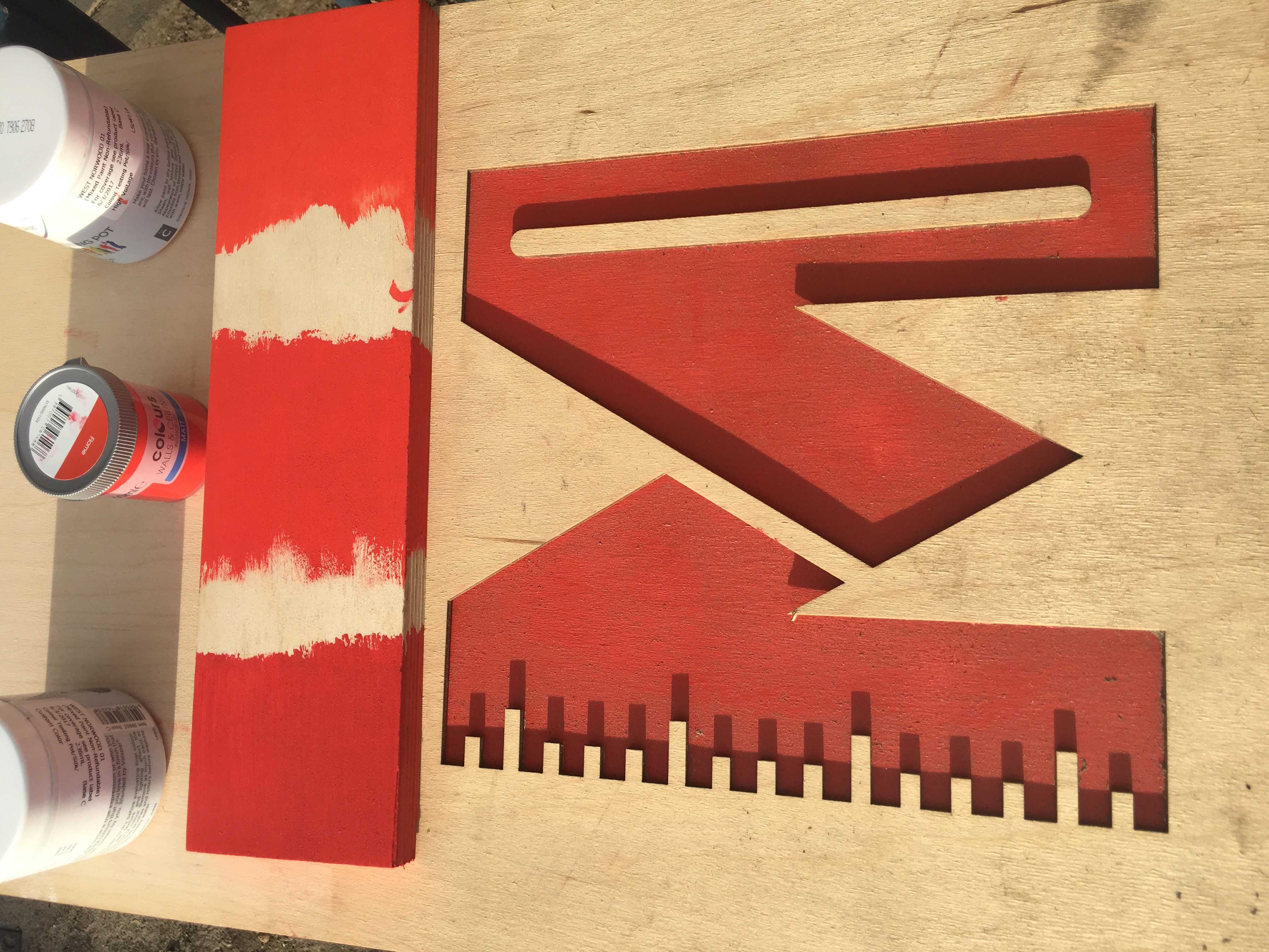
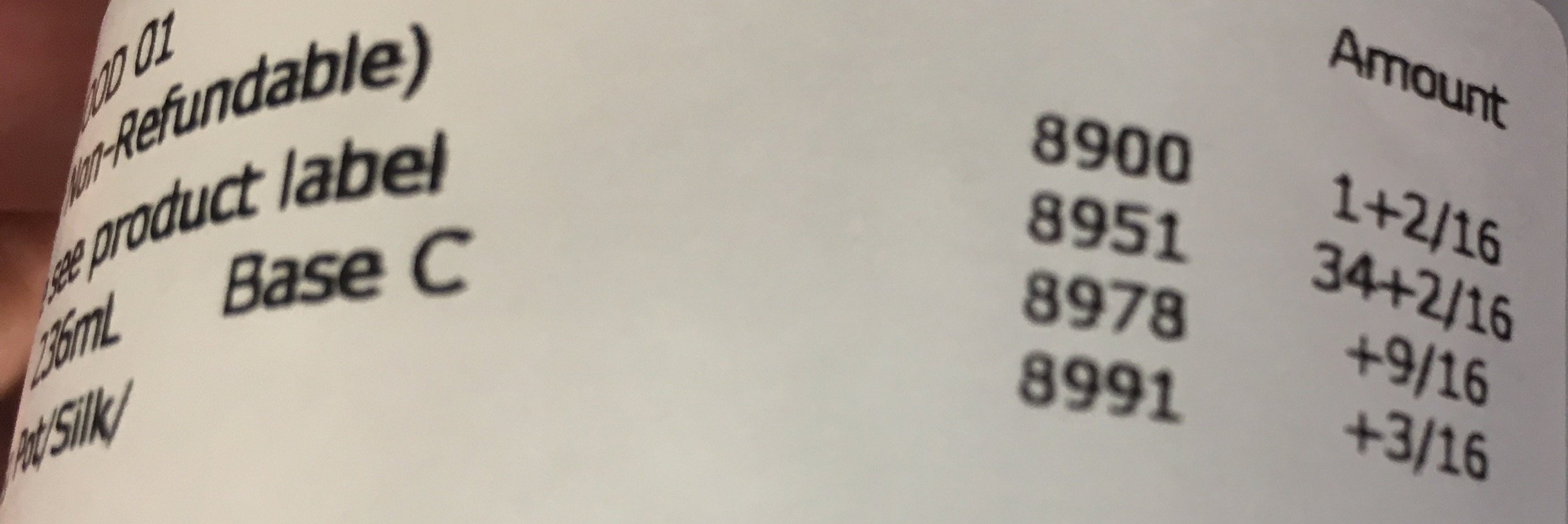
I think the custom mix and the flame one are probably best but thinking ahead the custom mix will be reproducible into the future, where as the flame one could disappear and no one would know what it was.

So in other words:

Valspar Silk:

1 Like

I’ll be down later tonight if anyone is around who wants to talk through the detail of the signs.

1 Like

It would be good to get your fred back on the three paints we tried.

I’ll be down at 7

Hopefully whatever we make will be better than the current one :laughing::laughing::laughing:

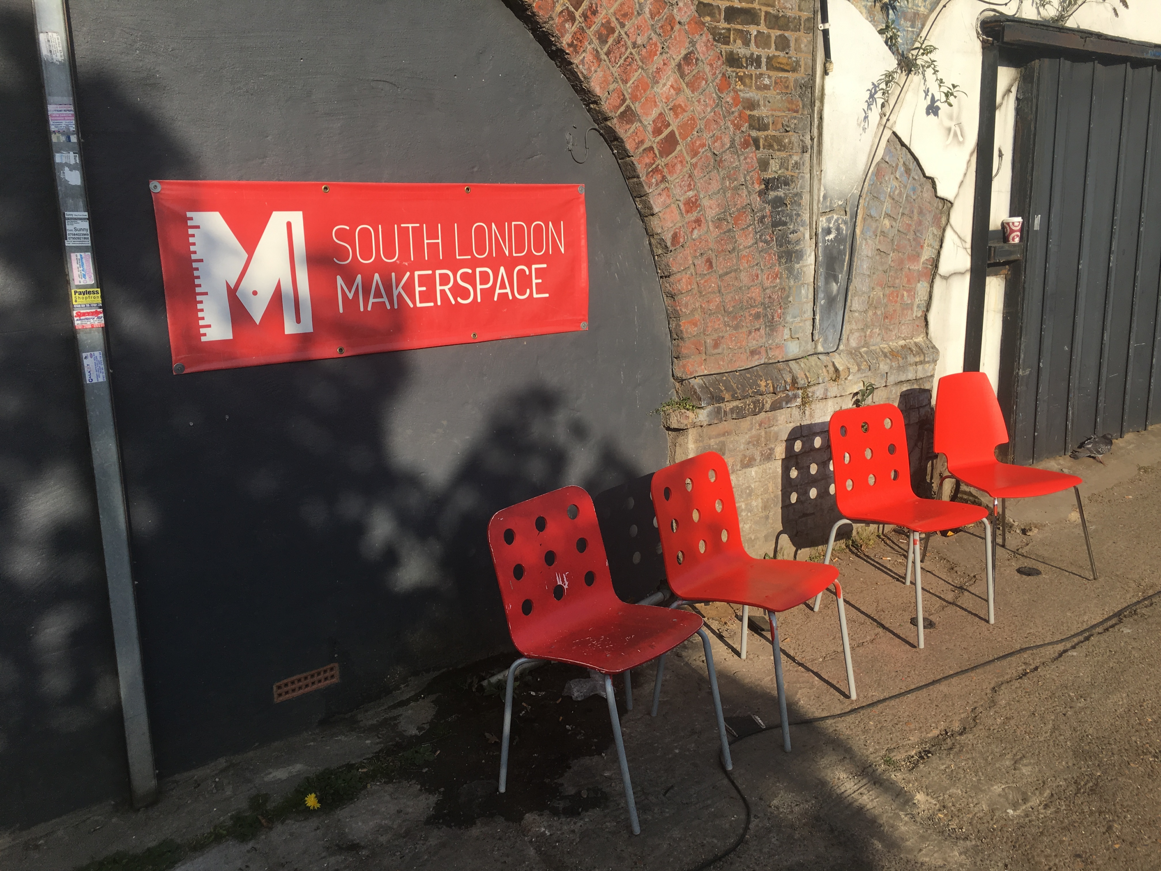
We took the sample outside and held it up to the big existing sign. Not to match it, but rather to see one colour over a big area rather than small sample.

The lightest, orangey one was pretty close to the colour there, and at that scale looked red. The impression I got was the other custom mix sample while it looks very red at a small size will look dark at scale.

…but, that was at night. That’s not invalid, but need to do this in daylight.

That is, if we are trying to choose a paint for everything, for the future. If we just want to paint a single sign, any of those samples might prove to be enough already and we can just get on with it.

I’ve shown and asked 8 people the samples:
5 went for the darker red.
2 went for the orangey one.
1 went for the middle “fire” red.

But Toby maybe right it would be good to see it on a big scale and in day light.

I may need to hand over the baton on this one soon as having been to b and q twice Its getting a little fatigueing :blush:

Which ever we do ensure we have the mixture for it, not an off the shelf colour.

I’ve been doing some research into RGB/CMYK to paint conversions and found this:

http://encycolorpedia.com/ff0000

The colour we want is RAL 3026, I am just not sure quite where to buy it, but Brewers does RAL colours.

Can’t believe we are still going on about these :joy:

To be fair I think a lot of folks have been busy at work or school and not had the time of late, and frankly this is why this group should just meet in the space and hash it out as a conversation.

Can you explain how you got to RAL3026 and how it compares to the paints we have?

The working is all in that link above, I think?