
Don’t make the QR code too big, otherwise people will have to cross the road to fit it into the camera scanning window!
Pavement sign needs review
1 Like
Good point. How big do you think too big is?
My guess is that you could scan this from about 6 feet away but thats just a guess.
1 Like
210*210 is big enough?
I think 210 is the height of a piece of A4. I’ll tape some to my wall tomorrow and see what it looks like through my phone camera.
You reminded me of when QR codes were first popular. There were adverts opposite the tube platform with tiny QR codes on them. You couldn’t snapbthem without leaning out across the tracks. 
I guess the designers didn’t quite think it through.
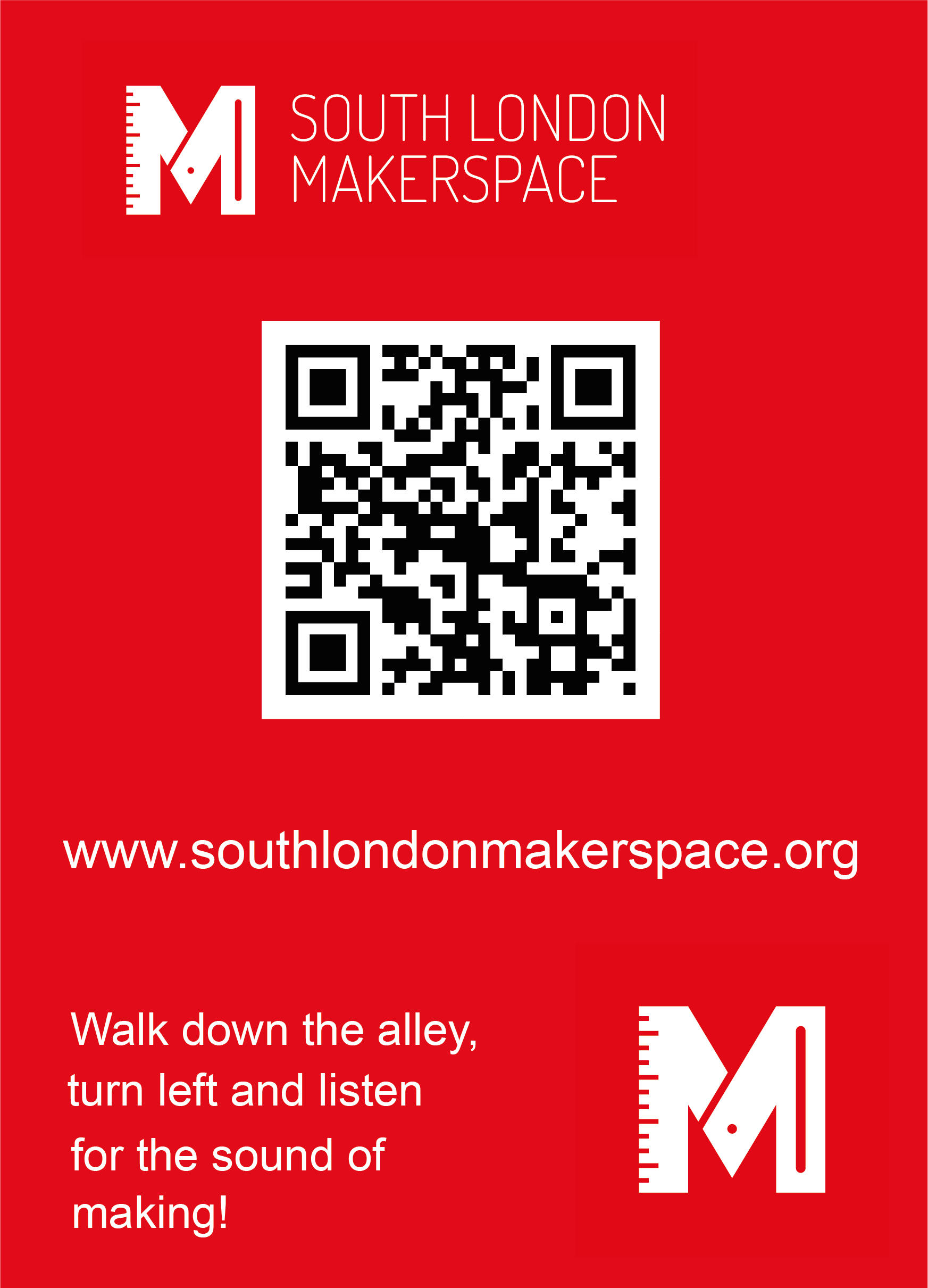
OK, I’ve updated the font and reduced the size of the QR code (small enough?).
What are the next steps folks?
1 Like
QR probably still too big at poster size?
Also logo/name could be bigger and everything aligned to the same margins!
I know this is for people coming to Open Evenings and other events.
However, passers by may be intrigued, so perhaps a short statement about what we are?
Sure, I can make those changes.
Would you like to craft a short statement about who we are?
Do we have other use cases for this sign? I know we are doing an event soon. Would we want this sign to have a dual purpose? Maybe we want the text giving directions to be removable?
Maybe the text just says something like “community workshop” instead of directions, and there is a magnetic arrow we can attach pointing in any direction?
OK, here’s the latest iteration. I’m not great with Illustrator so not sure how to get everything properly lined up. Just eyeballed it so far. I’ll upload the illustrator file in case anyone is good with that sort of thing.
I have some white magnetic ‘paper’ that we can use to make an arrow.
Makerspace sign.ai (1.4 MB)

Just bumping this.
What are the next steps or are we sticking with the existing sign?