
you know, the more I think about it, the more I think playing down the “south london” part of the name / logo is a positive thing.
Makerspace Logo/Brand
There are limits, though
5 Likes
haha I literaly have illustrator open to the left doing EXACTLY this 
1 Like
There are only so many jokes in the world 
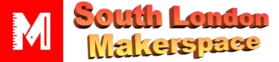
This is the solution…!
I vote this one because it looks classic and classy.
I know that one of you graphics guys would come up with something that the members could get behind.
DONE:
4 Likes
This positively oozes class:
6 Likes
Okay I take it back. There are no limits.
Cracking read everyone
To second @tobyspark is there an editable version of the new logo available to edit anywhere? SVG, ai, sketch
I agree with @tomnewsom that it’s workable to use one typeface within the logomark and second family for copy elsewhere. Source sans is a huuge family so offers the flexibility for all kinds of copy needs.
With the South London Makerspace wordmark I think we could look at tweaking the glyphs and letterspacing to improve legibility. Though I’m not suggesting an endless game of A4_portrait_version , A4_landscape_version, A3_portrait_version, etc
Also what is this CAD you speak of…
This isn’t accessible to all members (including me), should it be?
Ah, it’s in roles -> marketing. I don’t think we ever quite got permissions right. We didn’t want to distract with / invite into the behind-the-scenes stuff, but clearly it ended up private. That needs re-visiting, but I for one am busy with Saturday’s prep.
Hello, People!
Sorry, I haven’t been involved on this as I said I could do.
My problem is that the language is an issue sometimes.
What needs to be was done? is there anything I could help with.
Sorry, I lost the track so many threats ago…
: $
Ana
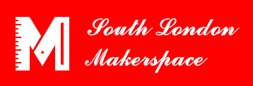
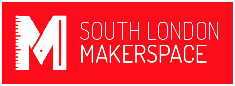
The M itself has been redrawn for clarity, but we never reached a conclusion about the logotype. It doesn’t get used all that much, but it’s useful to have.
The font is rather lightweight, especially the top line, which makes it indistinct at small sizes, and fiddly to handle when cut out of sheet materials.
Alternatives to this design are welcome! You can get the redrawn logo in my previous post from May 26th
Cool, Would it be a good idea to have different options of the logo and logotype for different porpuses?
(digital and printed such: media assets, banners, newsletter header, email…, then landscape and portrait, and small and large formats?
I can then work on a brand guide to make it easier for the user.
Ana
3 Likes
We’ve mostly used logo on it’s own with text next to it.
Yeah sure, but it’s free and doesn’t heart to have them. Maybe if we have them all we use them more accurately?
Also right sizes and formats?