We’ve just had a vote on what design we want.
After a couple of redesigns.
Now we’re redisnging again.
Ignoring everyone’s input on the vote.
Yellow card.

We’ve just had a vote on what design we want.
After a couple of redesigns.
Now we’re redisnging again.
Ignoring everyone’s input on the vote.
Yellow card.
I think it’s fine. It’s for out door use.
If you want you could color test a few different brands.
I’m not sure we are, I asked in the other thread if white meant wood or painted white, it would make more sense that it was wood like the old sign.
The design is the same, just asking about materials.
100% agree. Make a simple sign first and then jazz it up after…
At risk of upsetting the decision making, would a simple answer be to paint the whole thing in blackboard paint so it can be drawn on?
Nope, 'cos it’s not distinctive enough from a distance. I’d certainly thought about having a blackboard, think I mentioned that if canopy are replacing their signs we could appropriate for that.
But mainly, nothing has changed from this —
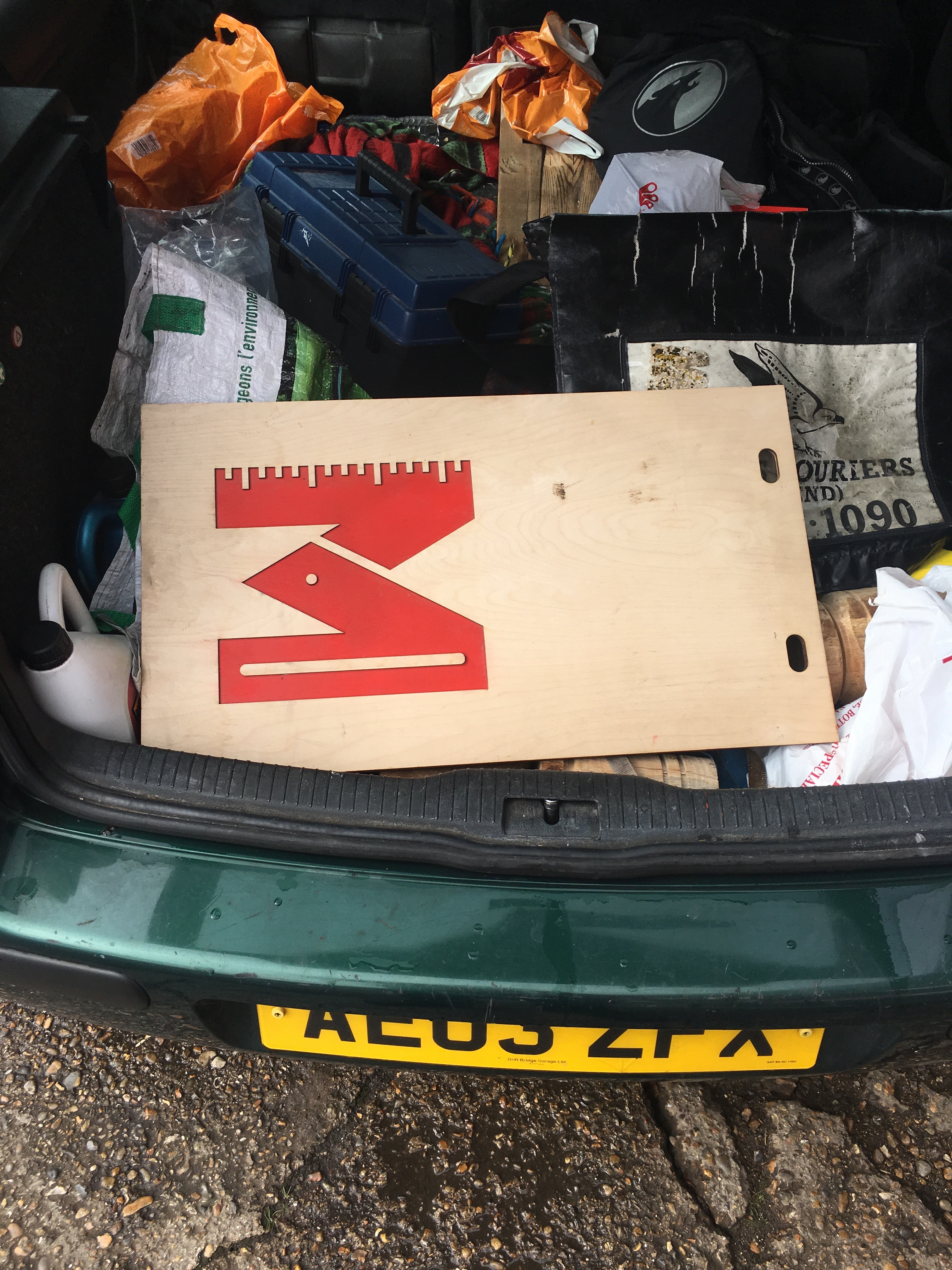
I’ve taken this sign. I’ll get a color match on it from b and q if its open tomorrow. Unless I here otherwise…
That’s just red spray paint.
Okay so not doing that then.
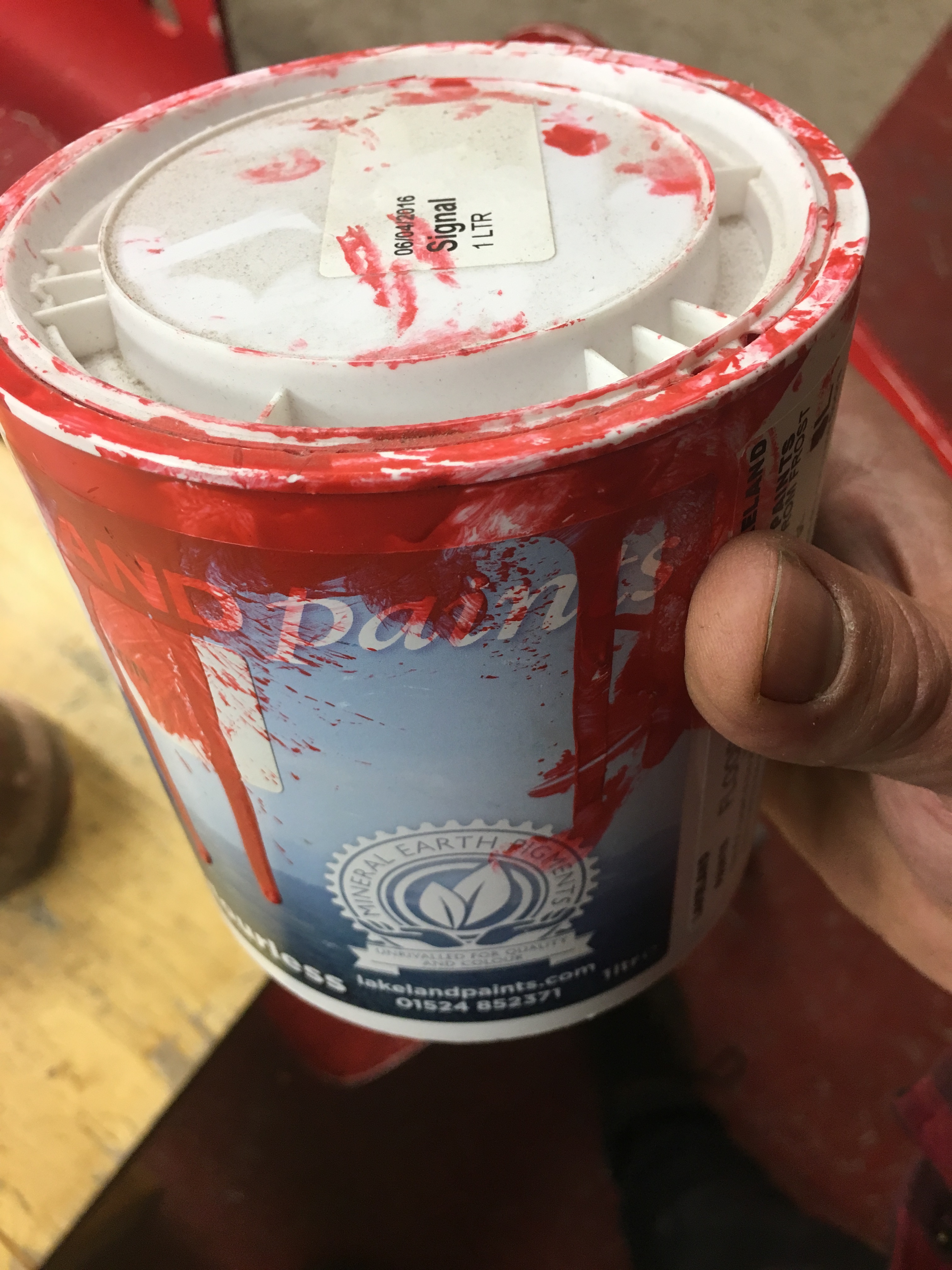
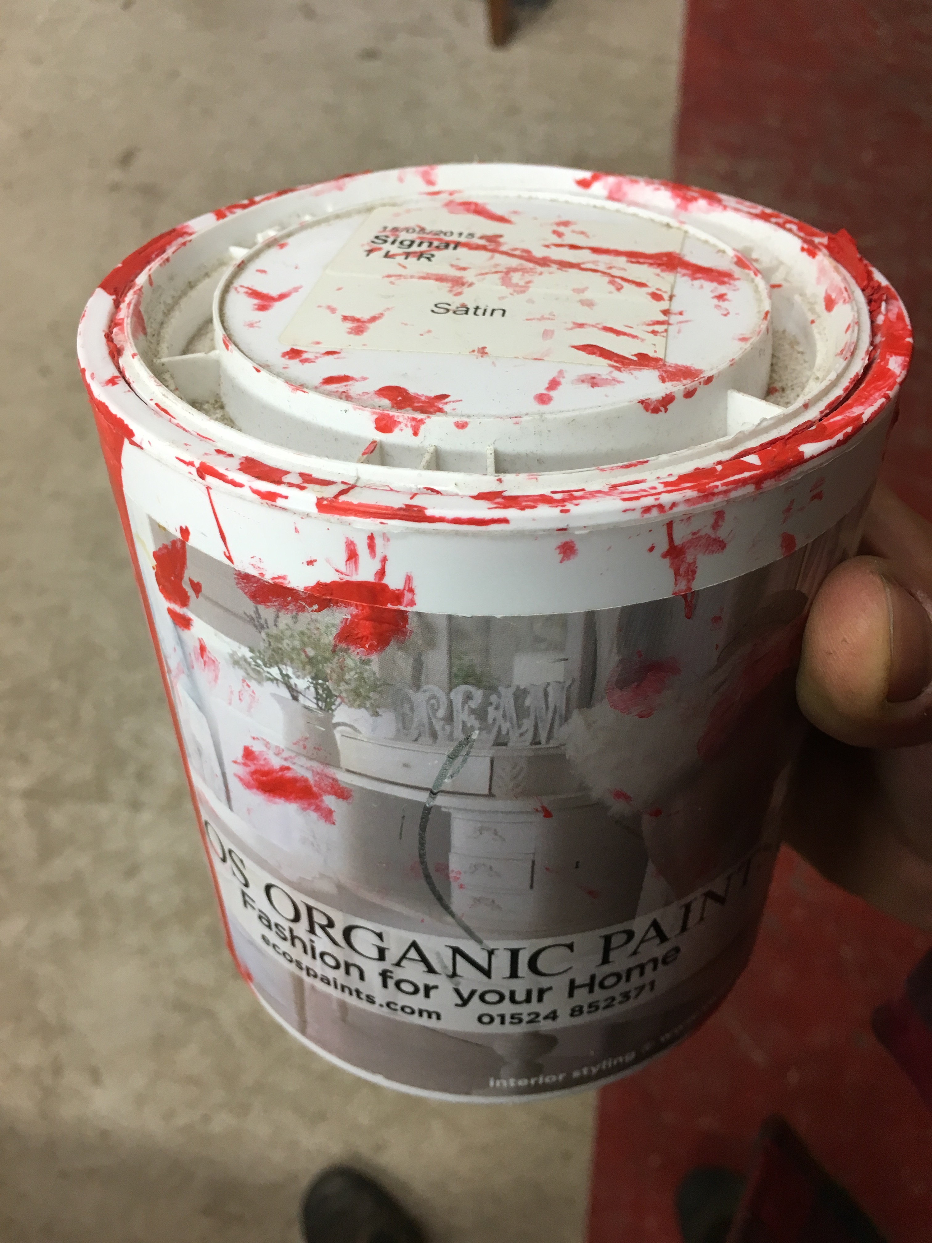
I found two tins of paint in the snug.
The are both called “signal”
One can with a date 2015 and other with date 2016.
Shall we get another one of these?
Or this:
sounds a plan.
In practice, my understanding is that it’s really just the most ‘Red’ Red, one can buy that is needed, the red we use is 255 0 0 RGB for screen afaik?
Yes that correct.
There is no specific red used for painting walls etc because there isn’t really a system.
Things to look out for:
Try to go for a bold red, you know what our colour is, I’m sure you’ll pick it just fine. We should make more effort to document this though.
Yeah, use your judgement Paul. It’ll be fine
What about just using the current paint - i.e has it been checked that it’s definitely gone off - less than a year old and I’d think it’d still be fine and I don’t imagine a sign needs much…
They are floor paints
That’s fine yes. But I guess we have to have this convo sooner or later any way.
This time we can save the details of the paint we get and then going forward we can then use the same paint.
Dury is still out on the chairs.
Just put a secounf coat on.
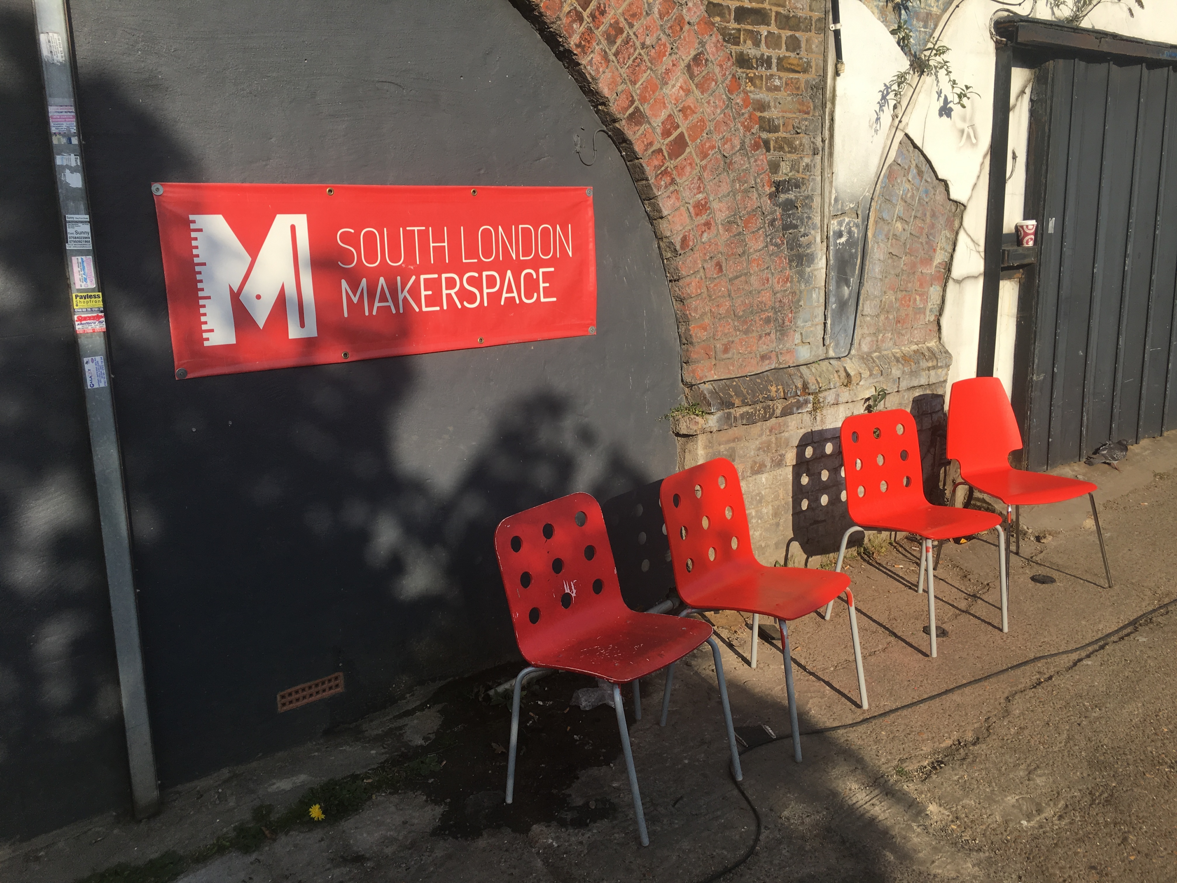
I’ve painted three chairs as a test run for the signs.
Come to the space and have s look.
They look more orange than they old red.
Might need a secound attempt to get the color match we were expecting.
One in left hasn’t been painted
Looks good to me!
Bright reds confound digital cameras, so will have to see then in the flesh!
I wouldn’t do colour matching it’s better to pick a colour. If you want I can go to b&q and find the swatch again.
You’re right.
In the picture they look one way (ok) in reality they look like another (like a bad orange fake tan).
This could solve our problems for what to do in the snug. Maybe a nail salon and a tanning booth! Who’s with me??